From Flyer to TV Screen
What to Keep and What to Cut
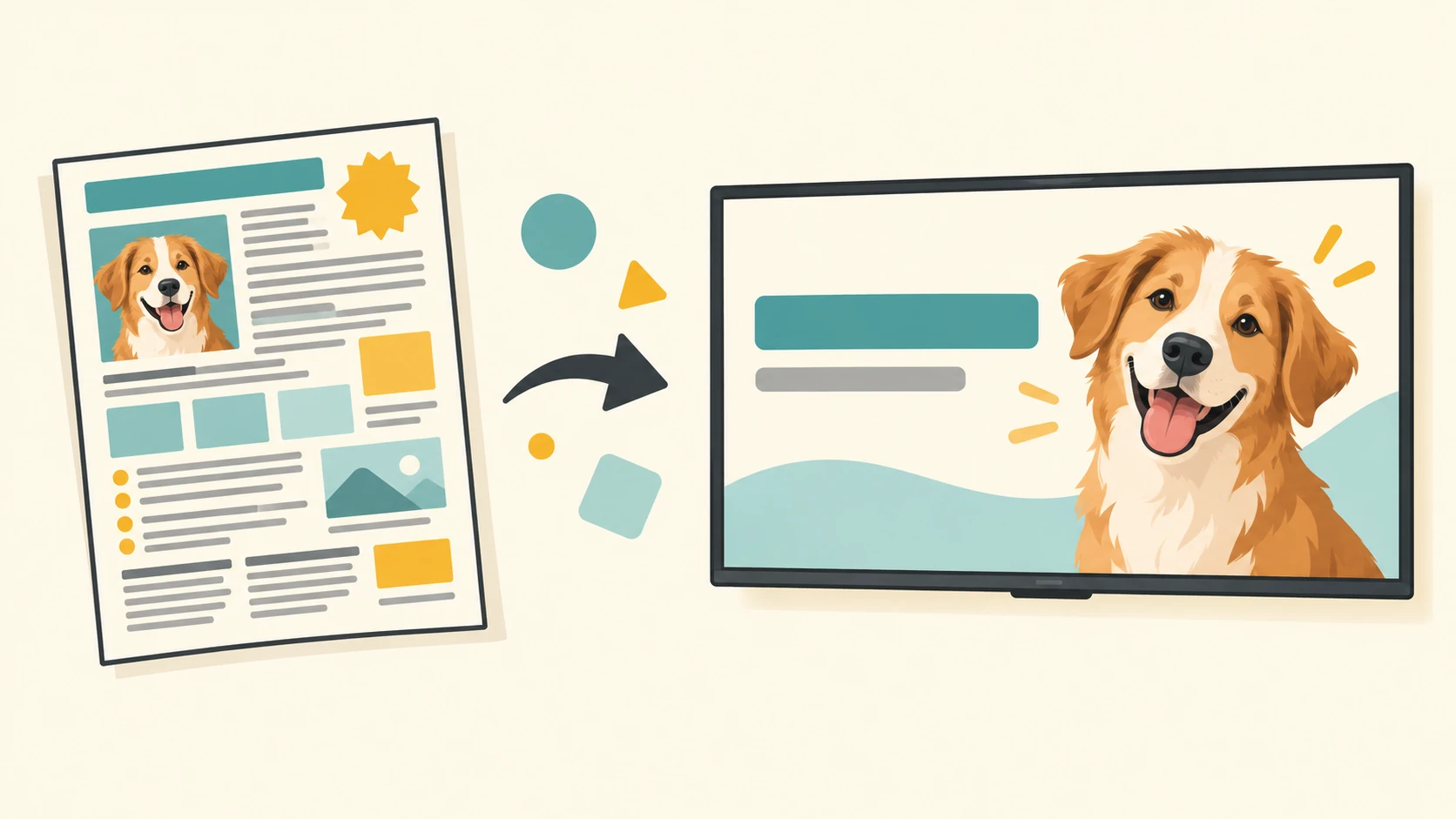
You’ve got a flyer announcing a new service, a seasonal special, or a change in hours. It looks fine on the counter, where someone can pick it up and read the details.
Then you put the same flyer on your lobby TV. From across the room, it’s a lot of tiny words, three different fonts, and a phone number doing its best to disappear.
A flyer and a screen graphic have different jobs. A flyer can hold details for someone to read up close. A TV graphic needs to make its point quickly, at a distance, while somebody’s waiting for an appointment.
Pick the one thing people need to know
Start by asking: What’s the main message?
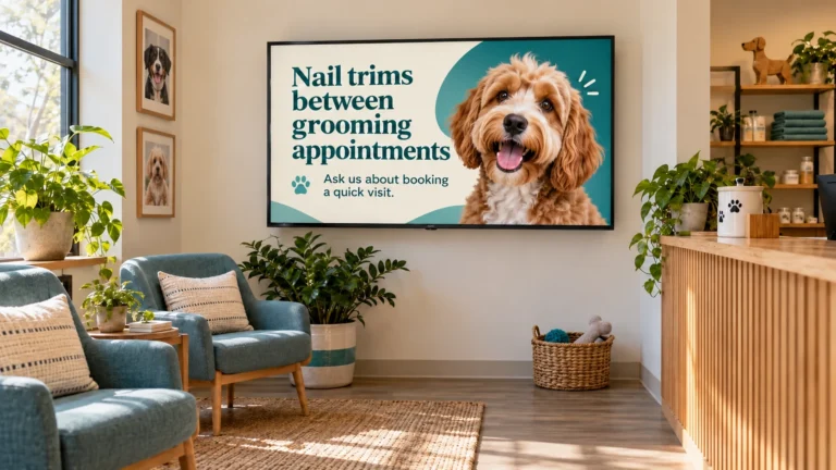
Say a grooming salon has a flyer about nail trims between full grooming appointments. The flyer might include hours, booking instructions, payment details, and a note about which pets the service is for.
A screen graphic probably doesn’t need all of that at once. It could lead with:
Nail trims between grooming appointments
Ask us about booking a quick visit.
That gives customers the key information and a next step. If there are details they need before booking, staff can answer questions or point them to the full flyer.
Give the small details somewhere else to live
This is where editing gets tricky. The extra information may be useful—it just may not belong on the screen.
For a café’s new seasonal drink, the graphic might show the drink, its name, and price. The menu can hold the full description and any details customers need. An auto shop might use a screen to remind customers that after-hours key drop-off is available, then put the complete instructions beside the drop box.
Think of the screen as a quick introduction to the service or update. It doesn’t have to carry every detail from the original flyer.
Make it easy to read from across the room
On a flyer, someone can move closer, hold it in their hands, and read small print. On a TV, the customer may be several seats away and only glance up for a few seconds.
Use a clear headline and text that’s easy to read. Keep enough contrast between the words and background. If a photo is busy, put the text on a solid or lightly shaded area so it doesn’t get lost.
Try stepping back from your monitor—or looking at the design from across the room. If you have to squint, so will your customers. Nobody came in hoping for an impromptu eye exam.
Keep the personality, lose the clutter
A flyer’s colors, photos, and style can still inspire the screen graphic. You don’t have to strip out everything that makes it feel like your business.
Keep the parts that help customers recognize the message: a familiar color, a photo of the service, or the friendly wording you use at the counter. Then remove anything that pulls attention away from the message.
You can also turn one flyer into a few separate graphics. A veterinary office might make one screen about appointment reminders and another about keeping pets comfortable in the waiting room. Each message gets more room, and customers don’t have to read a wall of text before the screen changes.
Before you move a flyer onto a TV, try this: keep the main message, one useful detail, and one next step. Save the rest for a menu, handout, sign, or conversation.
Lobby Looks started after I discovered how much I enjoyed creating TV graphics for a local pet grooming salon. I’m based in Rhode Island and create custom graphics for waiting rooms and in-store displays. Send your flyer my way, and I can help turn it into something that’s easy to read on screen.